There are many principles governing composition, yet none is more basic than variation. Variation is all about the differences between elements. Big shapes versus small shapes. Differences in the intervals between shapes. If there’s a cardinal rule of composition, it is that variation and differences keep a composition alive and interesting. Keep the viewer’s eye active and engaged.
In this post, I’ll use one of my Stonehenge paintings to demonstrate two important aspects of variation — size and intervals.
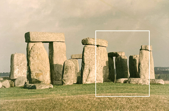
Source Image
 The source image indicates the portion of the subject that I would focus on. This is a photo I took myself, back in the late 1980s. It pays to hold onto those old source photos; you never know when they’ll offer inspiration.
Converting a daytime source into a nighttime scene. Obviously, the source image was photographed in daylight. Using my understanding of the kinds of colors that appear in nocturnes, I translated the daylight subject into a moonlit scene. For more on the nocturne palette, see The Colors of Night: Color Strategies for Painting Landscape Nocturnes.
Original Digital Study

The original photo-based study was a square format. My reason for choosing this format turned out to be a very poor one. I had done two previous Stonehenge nocturnes that were square, so I thought if this one was also square, it would make the set feel more compatible. As popular as it is, the square format is not an easy one. Here, the composition feels somewhat static. The movement from left to right, and from top to bottom, is about the same. If you compare the square composition to the vertical one below, you’ll see that the vertical format seems to suggest more upward movement. The stones rise.
First Underpainting – Poor Intervals
 The vertical format aligns better with the natural upward thrust of the stones. However, there isn’t enough variation in the width of the stones themselves or the spaces in between the stones. In the right image, the white arrows show that the width of the four stones are nearly identical. The vertical yellow lines indicate the narrow gaps between the middle stones, which are identical in width. Although this is how the subject appears in my source image, introducing slight variations will add greater interest to the composition.

On the left, the final painting: Moonlight, Stonehenge, III, 2025, oil on paper, 11 x 9 inches.
In the analysis on the right, the white arrows indicate considerably more variation in the widths of the stones. The vertical yellow lines show much wider intervals between the stones. If you compare the final composition to the first square study, or the first underpainting, you can see that it feels more rhythmical. It’s no longer static—there’s a sense of movment and asymetrical balance. All that adds up to a more engaging composition.
When it comes to variation, even subtle changes in shape size or intervals — the pacing and spacing between elements — can transform a painting from passive to dynamic.
See additional painting from the Nocturne series.
Additional Resources
from The Landscape Painter’s Workbook: Essential Studies in Shape, Composition, and Color
Chapter 3: Composition in Action
More on composition on this blog:
How to Re-Compose a Landscape Painting with a Limited Focus or Cropping
Improving Color and Composition in Landscape Painting with the “Azure & Asphalt” Series
Landscape Composition: Building Interest through Intervals and Variation
Improving Landscape Composition with Perspective Cues and Land- or Sky-Dominant Cropping
Demonstration: Exploring Landscape Composition Through a Limited Focus
